Data Visualization
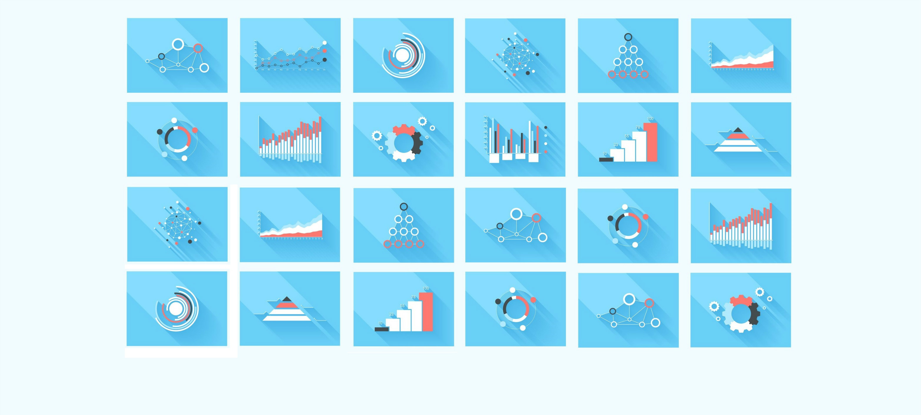
No big data project is complete without sophisticated dashboard and reports filled with charts. A picture can tell a thousand words, and for us these pictures are visualizations. Every pool of data has story hidden into it, and to bring out this story we need data visualization. Data visualization helps us understand data easily, a typical management report will only have static data, dismissing all the facts and relation it can have with other data which can contribute in finding new opportunity, where as Data Visualization can allow user to drill down multidimensional data sets, see graphs and relations with the nodes, traverse through a time series data, generate sophisticated heat maps, fever charts and many more rich graphical data representations.
We work with different visualization framework and tools to make it seamless for the user to consume it. There are many platforms which provide data exploratory and visualization like Tableau, Microsoft Power BI, Pentaho, QlikView and Sportfire. We like Microsoft Power BI and Tableau the most. Because these tools get out of the way of user and what is easy to use, loved the most. We also create custom dashboards and layout using powerful D3.js as and when required. Most importantly when we use any of the platform or D3 to build visualizations we first go in depth and play with the underlying data store to grasp characteristics of the data itself, we give time to prepare the data to transform it into something which people like to use, explore and love back.
No matter which platform you use or how powerful your visualization tool/technology is, it is still lacking and require us, because they can’t decide which chunk of data to pick and in which format it is best suited to display. Hence we put good amount of time in understanding user’s point of view and how they are going to use the visualization, after which we decide on the type of visualization that best suited for user need.
Visualization greatly improves our understanding about the data and can reveal hidden gems, but to make data talk to visualization in meaningful manner we require engineering team to gel them well and create harmony between them.
Subscribe for a monthly roundup of best bits for Big Data and Azure.
Don't worry, we hate spam too, Promise. That's why we only send out monthly emails.
Sign up & get updates strainght to you inbox
Stay in the loop with our awesome newsletter. We'll send you monthly
updates of our latest and greatest tools and resources.
